The CSS flex-grow property specifies how much the item will grow relative to the rest of the flexible items inside the same container. It is essential for responsive design, allowing elements to expand based on available space, and ensuring a dynamic and adaptable layout.
Note: If the item in the container is not flexible then the flex-grow property will not affect that item.
Syntax
flex-grow: number| initial| inherit;Default Value: 0
Property values
Property Value | Description |
|---|---|
number | A number that defines how the item will grow compared to other flexible items. |
initial | It sets the value to its default value. |
inherit | It inherits the property from its parent elements. |
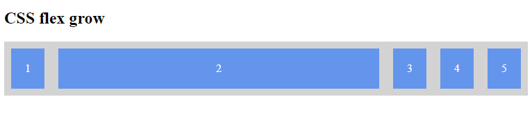
Example 1: Basic Usage of flex-grow
In this example, we have a container with five div elements. The second div has a flex-grow value of 2, which means it will grow twice as much as the other div elements.
<!DOCTYPE html>
<html lang="en">

<head>
    <meta charset="UTF-8">
    <meta name="viewport"
          content="width=device-width,
                   initial-scale=1.0">
    <title>Flex Grow Example</title>
    <style>
        .container {
            display: flex;
            width: 100%;
            background-color: lightgray;
        }

        .container div {
            background-color: cornflowerblue;
            margin: 10px;
            padding: 20px;
            text-align: center;
            color: white;
        }

        .grow {
            flex-grow: 2;
        }
    </style>
</head>

<body>
    <h2>CSS flex grow</h2>
    <div class="container">
        <div>1</div>
        <div class="grow">2</div>
        <div>3</div>
        <div>4</div>
        <div>5</div>
    </div>
</body>

</html>
Output:
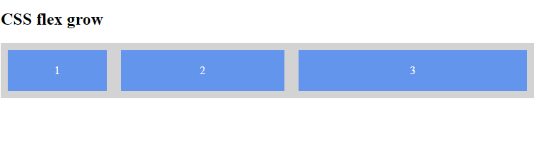
Example 2: Multiple Elements with Different flex-grow Values
This example demonstrates multiple div elements with different flex-grow values to show how they grow relative to each other.
<!DOCTYPE html>
<html lang="en">

<head>
    <meta charset="UTF-8">
    <meta name="viewport"
          content="width=device-width,
                   initial-scale=1.0">
    <title>Flex Grow Multiple Values</title>
    <style>
        .container {
            display: flex;
            width: 100%;
            background-color: lightgray;
        }

        .container div {
            background-color: cornflowerblue;
            margin: 10px;
            padding: 20px;
            text-align: center;
            color: white;
        }

        .grow1 {
            flex-grow: 1;
        }

        .grow2 {
            flex-grow: 2;
        }

        .grow3 {
            flex-grow: 3;
        }
    </style>
</head>

<body>
    <h2>CSS flex grow</h2>
    <div class="container">
        <div class="grow1">1</div>
        <div class="grow2">2</div>
        <div class="grow3">3</div>
    </div>
</body>

</html>
Output:
Supported Browser
The browser supported by CSS flex-grow Property are listed below:
- Google Chrome 5.0
- Edge 12
- Mozilla 4.0
- Safari 5.0
- Opera 11.1