Seaborn is a Python library for creating statistical visualizations. It provides clean default styles and color palettes, making plots more attractive and easier to read. Built on top of Matplotlib and integrated with pandas data structures, Seaborn makes data visualization easier and more consistent.
- Seaborn emphasizes visualization as an essential part of data analysis.
- Its dataset-oriented APIs allow switching between different plot types for the same variables.
- Helps in understanding patterns, trends and relationships within the data.
Categories of Plots in Seaborn
Plots are basically used for visualizing the relationship between variables. Those variables can be either completely numerical or a category like a group, class, or division. Seaborn divides the plot into the below categories:
- Relational plots: used to understand the relation between two variables (e.g., lineplot, scatterplot)
- Categorical plots: deals with categorical variables and how they can be visualized (e.g., boxplot, violinplot, barplot)
- Distribution plots: show data distribution (e.g., histplot, kdeplot)
- Regression plots: show relationships with regression line (e.g., lmplot, regplot)
- Matrix plots: visualize matrices (e.g., heatmap)
- Multi-plot grids: plot multiple graphs together (e.g., FacetGrid)
Installation
For Python environment:
pip install seaborn
For conda environment:
conda install seaborn
Dependencies for Seaborn Library
There are some libraries that must be installed before using Seaborn. Here we will list out some basics that are a must for using Seaborn.
- Python 3.6+
- numpy (>= 1.13.3)
- scipy (>= 1.0.1)
- pandas (>= 0.22.0)
- matplotlib (>= 2.1.2)
Note: Most of these dependencies are automatically installed when you install Seaborn, but it is important to have compatible versions to avoid errors.
Basic Plots in Seaborn
1. Lineplot
Lineplot is used to show the relationship between two continuous variables. It is commonly used for time-series or ordered data.
Example: Visualizing trend over time
import seaborn as sns
import matplotlib.pyplot as plt

fmri = sns.load_dataset("fmri")
sns.lineplot(x="timepoint", y="signal", hue="region", data=fmri)
plt.show()
Output
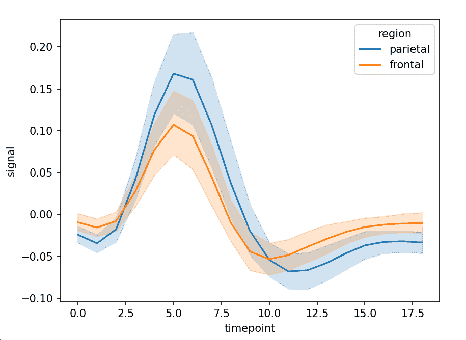
Explanation: x="timepoint" sets time on x-axis, y="signal" values plotted on y-axis and hue="region" separates lines by region
2. Scatterplot
Scatterplot is used to show the relationship between two numerical variables. It helps in identifying patterns or correlations.
Example: Relationship between total bill and tip
import seaborn as sns
import matplotlib.pyplot as plt

tips = sns.load_dataset("tips")

sns.scatterplot(x="total_bill", y="tip", hue="day", data=tips)
plt.show()
Output
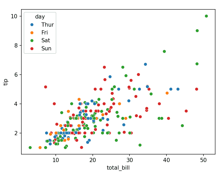
Explanation: x, y numerical variables and hue="day" adds color grouping
3. Barplot
Barplot is used to compare numerical values across categories. It shows the average value with confidence intervals.
Example: Average total bill per day
import seaborn as sns
import matplotlib.pyplot as plt

tips = sns.load_dataset("tips")

sns.barplot(x="day", y="total_bill", data=tips)
plt.show()
Output
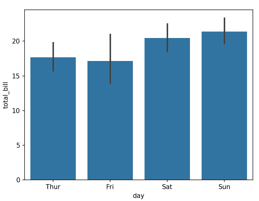
Explanation: x="day" categories and y="total_bill" aggregated values (mean by default)
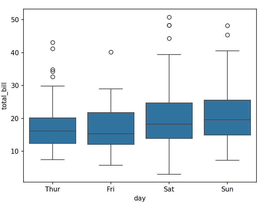
4. Boxplot
Boxplot is used to show the distribution of data based on quartiles. It helps identify spread and outliers.
Example: Distribution of total bill by day
import seaborn as sns
import matplotlib.pyplot as plt

tips = sns.load_dataset("tips")

sns.boxplot(x="day", y="total_bill", data=tips)
plt.show()
Output
5. Histplot
Histplot is used to visualize the distribution of a single numerical variable.
Example: Distribution of total bill
import seaborn as sns
import matplotlib.pyplot as plt

tips = sns.load_dataset("tips")

sns.histplot(tips["total_bill"], kde=True)
plt.show()
Output
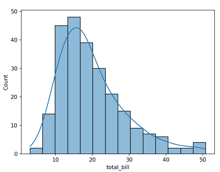
Explanation: kde=True adds density curve
6. Heatmap
Heatmap is used to visualize matrix-like data using colors. It is commonly used for correlation matrices.
Example: Correlation heatmap
import seaborn as sns
import matplotlib.pyplot as plt

tips = sns.load_dataset("tips")
corr = tips.corr(numeric_only=True)

sns.heatmap(corr, annot=True, cmap="coolwarm")
plt.show()
Output
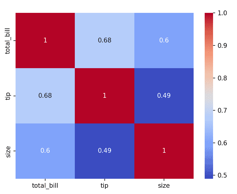
Explanation: annot=True displays values and cmap controls color scheme
7. Pairplot
Pairplot is used to plot pairwise relationships between multiple numerical variables.
Example: Pairwise relationships in dataset
import seaborn as sns
import matplotlib.pyplot as plt

iris = sns.load_dataset("iris")
sns.pairplot(iris, hue="species")
plt.show()
Output
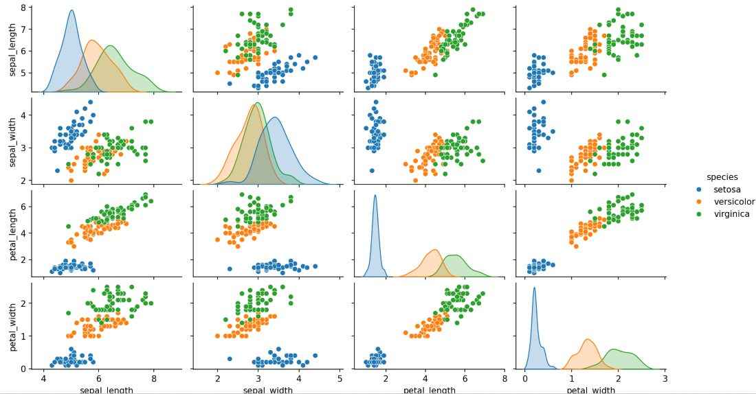
Explanation: hue adds category distinction