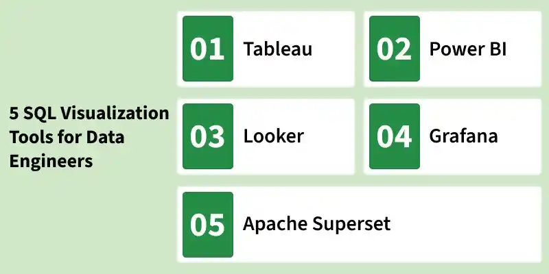
SQL Visualization Tools help data engineers convert raw database data into clear, actionable insights. By transforming SQL query results into charts, dashboards and reports, these tools make it easier to identify trends, patterns and performance issues.
They enable direct database connectivity and support:
- Interactive dashboards
- Real-time analytics
- Advanced data modeling
- Team collaboration and reporting

Below are five widely used SQL visualization tools in the industry.
Tableau
Tablue is widely used for interactive and shareable dashboards, suitable for complex data analysis. Its user-friendly, drag-and-drop interface makes it accessible to users of all skill levels, while its extensive range of visualization options caters to diverse analytical needs. Tableau supports a wide array of data sources, making it highly versatile for various business environments.
Key Features:
- Drag-and-drop interface
- Advanced analytics capabilities
- Wide range of data source integration
Use Cases:
- Business intelligence dashboards
- Enterprise-level reporting
- Complex multi-source data analysis
Pros:
- Highly interactive and user-friendly interface.
- Extensive range of visualization options.
- Strong community support and regular updates.
Cons:
- Can be expensive for small businesses.
- Resource-intensive, requiring powerful hardware.
Power BI
Power BI helps to Integrates seamlessly with Microsoft products, enhancing real-time analytics and reporting.It offers robust data connectors, AI-powered insights and interactive dashboards, making it suitable for organizations of all sizes seeking a unified view of business metrics.
Key Features:
- Strong data connectors
- AI-driven insights
- Interactive dashboards
Use Cases:
- Organizational reporting
- KPI tracking
- Real-time business monitoring
Suitable for organizations of all sizes seeking a unified view of business metrics.
Pros:
- Affordable, especially for organizations already using Microsoft products.
- Robust integration with other Microsoft tools.
- Large community and extensive support resources.
Cons:
- Steeper learning curve for beginners.
- Performance issues with very large datasets.
Looker
Looker helps to connects directly to databases for real-time data access, ideal for data-driven decisions. Looker is particularly suitable for detailed reporting and comprehensive analytics across various industries, promoting a data-driven culture within organizations.
Key Features:
- Advanced data modeling
- Real-time database connectivity
- Custom dashboard creation
Use Cases:
- Detailed reporting
- Enterprise analytics
- Data-driven decision-making
Pros:
- Direct connection to databases for real-time analysis.
- Powerful data modeling capabilities.
- Suitable for data-driven decision-making.
Cons:
- High cost, making it less accessible for small businesses.
- Requires technical expertise to maximize its features.
Grafana
Grafana is primarily used for system monitoring and real-time visualization, perfect for IT operations. It offers real-time monitoring, alerting and support for multiple data sources, making it an excellent tool for tracking system and application performance metrics.
Key Features: Real-time monitoring, alerting and support for multiple data sources.
Use Cases: Ideal for continuous system and application monitoring.
Pros:
- Free version available, making it accessible to all.
- Excellent for real-time monitoring and system metrics.
- Highly customizable and flexible.
Cons:
- Limited to specific use cases, mainly monitoring.
- Not as versatile for business intelligence needs.
Apache Superset
Apache Superset is an open-source business intelligence platform built for modern data exploration and interactive visualization. It enables data engineers and analysts to query databases directly and create dynamic dashboards with minimal setup.
Key Features:
- Built-in SQL editor
- Interactive and customizable dashboards
- Open-source and highly extensible
- Supports a wide range of SQL databases
Use Cases:
- Open-source business intelligence dashboards
- SQL-based data exploration
- Data warehouse visualization
Pros:
- Cost-effective alternative to paid BI tools
- Strong open-source community support
- Flexible and highly customizable
Cons:
- Requires technical setup and configuration
- UI is less polished compared to premium BI tools
Comparison of SQL Visualization Tools for Data Engineers
| Feature | Tableau | Power BI | Looker | Grafana | Apache Superset |
|---|---|---|---|---|---|
| Ease of Use | High | Medium | Medium | High | Medium |
| Integration | Extensive | Extensive | Good | Good | Good |
| Customization | High | High | High | Medium | High |
| Cost | High | Medium | High | Free/Paid | Free (Open-source) |
| Support | Extensive | Extensive | Extensive | Good | Community-based |
| Real-time Analytics | Yes | Yes | Yes | Yes | Yes |
| Community Support | Strong | Strong | Strong | Moderate | Strong (Open-source) |
| Learning Curve | Low | Medium | High | Low | Medium |
| Data Modeling | Advanced | Basic | Advanced | Basic | Moderate |
| Ideal Use Case | Business Intelligence | General Reporting | In-depth Analysis | Real-time Monitoring | Open-source BI & SQL-based dashboards |