Exploratory Data Analysis (EDA) is an essential step in data analysis that focuses on understanding patterns, relationships and distributions within a dataset using statistical methods and visualizations. Python libraries such as pandas, NumPy, plotly, matplotlib and seaborn make this process efficient and insightful. Some common EDA techniques are:
- Data Inspection: Check the size of the dataset, how it is organized, the types of data it contains and basic summary values.
- Handling Missing and Duplicate Data: Find and fix empty values or repeated rows to keep the data clean.
- Univariate Analysis: Study one variable at a time to understand its distribution, trend and outliers.
- Bivariate Analysis: Compare two variables to see how they are related.
- Multivariate Analysis: Analyze three or more variables together to understand deeper relationships.
Key Steps for Exploratory Data Analysis (EDA)
Lets see various steps involved in Exploratory Data Analysis
Step 1: Importing Required Libraries
We need to install Pandas, NumPy, Matplotlib and Seaborn libraries in python to proceed further.
import pandas as pd
import numpy as np
import matplotlib.pyplot as plt
import seaborn as sns
import warnings as wr
wr.filterwarnings('ignore')
Step 2: Reading Dataset
Lets read the dataset using pandas.
Download the dataset from this link
df = pd.read_csv("/content/WineQT.csv")
print(df.head())
Output:

Step 3: Analyzing the Data
1. df.shape(): This function is used to understand the number of rows (observations) and columns (features) in the dataset. This gives an overview of the dataset's size and structure.
df.shape
Output:
(1143, 13)
2. df.info(): This function helps us to understand the dataset by showing the number of records in each column, type of data, whether any values are missing and how much memory the dataset uses.
df.info()
Output:

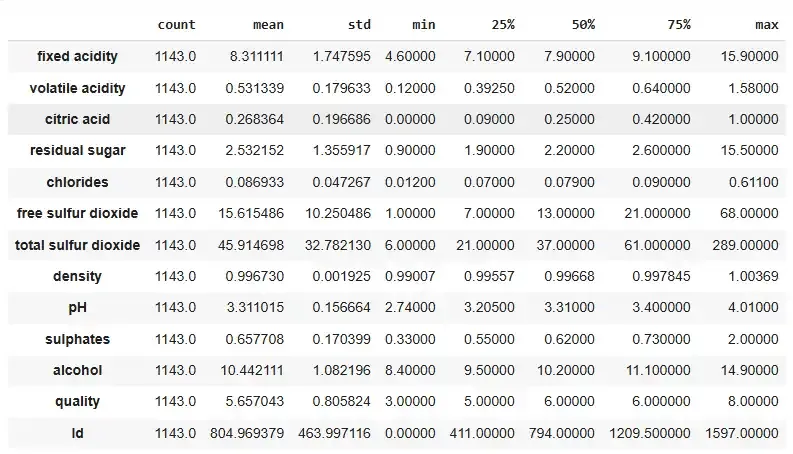
3. df.describe().T: This method gives a statistical summary of the DataFrame (Transpose) showing values like count, mean, standard deviation, minimum and quartiles for each numerical column. It helps in summarizing the central tendency and spread of the data.
df.describe().T
Output:
4. df.columns.tolist(): This converts the column names of the DataFrame into a Python list making it easy to access and manipulate the column names.
df.columns.tolist()
Output:

Step 4 : Checking Missing Values
df.isnull().sum(): This checks for missing values in each column and returns the total number of null values per column helping us to identify any gaps in our data.
df.isnull().sum()
Output:

Step 5 : Checking for the duplicate values
df.nunique(): This function tells us how many unique values exist in each column which provides insight into the variety of data in each feature.
df.duplicated().sum()
Output:

Step 6: Univariate Analysis
In Univariate analysis plotting the right charts can help us to better understand the data making the data visualization so important.
1. Bar Plot for evaluating the count of the wine with its quality rate.
quality_counts = df['quality'].value_counts()

plt.figure(figsize=(8, 6))
plt.bar(quality_counts.index, quality_counts, color='deeppink')
plt.title('Count Plot of Quality')
plt.xlabel('Quality')
plt.ylabel('Count')
plt.show()
Output:

Here, this count plot graph shows the count of the wine with its quality rate.
2. Kernel density plots help visualize the distribution of data and identify patterns such as skewness and density.
sns.set_style("darkgrid")

numerical_columns = df.select_dtypes(include=["int64", "float64"]).columns

plt.figure(figsize=(14, len(numerical_columns) * 3))
for idx, feature in enumerate(numerical_columns, 1):
    plt.subplot(len(numerical_columns), 2, idx)
    sns.histplot(df[feature], kde=True)
    plt.title(f"{feature} | Skewness: {round(df[feature].skew(), 2)}")

plt.tight_layout()
plt.show()
Output:

The features in the dataset with a skewness of 0 shows a symmetrical distribution. If the skewness is 1 or above it suggests a positively skewed (right-skewed) distribution. In a right-skewed distribution the tail extends more to the right which shows the presence of extremely high values.
3. Swarm Plot for showing the outlier in the data
plt.figure(figsize=(10, 8))

sns.swarmplot(x="quality", y="alcohol", data=df, palette='viridis')

plt.title('Swarm Plot for Quality and Alcohol')
plt.xlabel('Quality')
plt.ylabel('Alcohol')
plt.show()
Output:

This graph shows the swarm plot for the 'Quality' and 'Alcohol' columns. The higher point density in certain areas shows where most of the data points are concentrated. Points that are isolated and far from these clusters represent outliers highlighting uneven values in the dataset.
Step 7: Bivariate Analysis
In bivariate analysis two variables are analyzed together to identify patterns, dependencies or interactions between them. This method helps in understanding how changes in one variable might affect another.
1. Pair Plot for showing the distribution of the individual variables
sns.set_palette("Pastel1")

plt.figure(figsize=(10, 6))

sns.pairplot(df)

plt.suptitle('Pair Plot for DataFrame')
plt.show()
Output:

- If the plot is diagonal , histograms of kernel density plots shows the distribution of the individual variables.
- If the scatter plot is in the lower triangle, it displays the relationship between the pairs of the variables.
- If the scatter plots above and below the diagonal are mirror images indicating symmetry.
- If the histogram plots are more centered, it represents the locations of peaks.
- Skewness is found by observing whether the histogram is symmetrical or skewed to the left or right.
2. Violin Plot for examining the relationship between alcohol and Quality.
df['quality'] = df['quality'].astype(str)

plt.figure(figsize=(10, 8))

sns.violinplot(x="quality", y="alcohol", data=df, palette={
               '3': 'lightcoral', '4': 'lightblue', '5': 'lightgreen', '6': 'gold', '7': 'lightskyblue', '8': 'lightpink'}, alpha=0.7)

plt.title('Violin Plot for Quality and Alcohol')
plt.xlabel('Quality')
plt.ylabel('Alcohol')
plt.show()
Output:
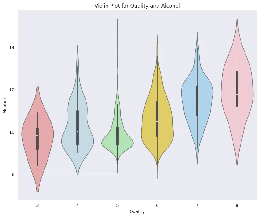
For interpreting the Violin Plot:
- If the width is wider, it shows higher density suggesting more data points.
- Symmetrical plot shows a balanced distribution.
- Peak or bulge in the violin plot represents most common value in distribution.
- Longer tails shows great variability.
- Median line is the middle line inside the violin plot. It helps in understanding central tendencies.
3. Box Plot for examining the relationship between alcohol and Quality
sns.boxplot(x='quality', y='alcohol', data=df)
Output:
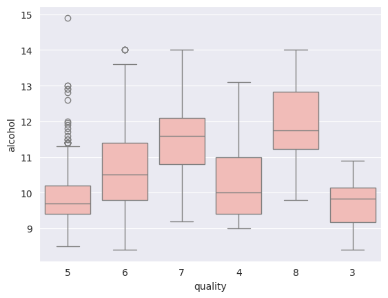
Box represents the IQR i.e longer the box, greater the variability.
- Median line in the box shows central tendency.
- Whiskers extend from box to the smallest and largest values within a specified range.
- Individual points beyond the whiskers represents outliers.
- A compact box shows low variability while a stretched box shows higher variability.
Step 8: Multivariate Analysis
It involves finding the interactions between three or more variables in a dataset at the same time. This approach focuses to identify complex patterns, relationships and interactions which provides understanding of how multiple variables collectively behave and influence each other.
Here, we are going to show the multivariate analysis using a correlation matrix plot.
plt.figure(figsize=(15, 10))

sns.heatmap(df.corr(), annot=True, fmt='.2f', cmap='Pastel2', linewidths=2)

plt.title('Correlation Heatmap')
plt.show()
Output:

Values close to +1 shows strong positive correlation, -1 shows a strong negative correlation and 0 suggests no linear correlation.
- Darker colors signify strong correlation, while light colors represents weaker correlations.
- Positive correlation variable move in same directions. As one increases, the other also increases.
- Negative correlation variable move in opposite directions. An increase in one variable is associated with a decrease in the other.