DBSCAN is a clustering algorithm that groups closely packed points and marks low-density points as outliers. It does not require a predefined number of clusters and can detect clusters of arbitrary shapes. Using scikit-learn, it is used to identify clusters and detect noise in data.
- Identifies core points using eps (distance) and min_samples (minimum neighbors).
- Expands clusters from core points by including all reachable points within eps distance.
- Marks points not belonging to any cluster as noise or outliers.
Step By Step Implementation
Here we implement the DBSCAN clustering algorithm on a moon-shaped dataset using Scikit-learn and visualize the results.
Step 1: Import Required Libraries
Import necessary libraries numpy for numerical operations, matplotlib.pyplot for visualization, make_moons to create a sample dataset, DBSCAN for clustering and NearestNeighbors to estimate distances for epsilon.
import numpy as np
import matplotlib.pyplot as plt
from sklearn.datasets import make_moons
from sklearn.cluster import DBSCAN
from sklearn.neighbors import NearestNeighbors
Step 2: Generate Moon-shaped Dataset
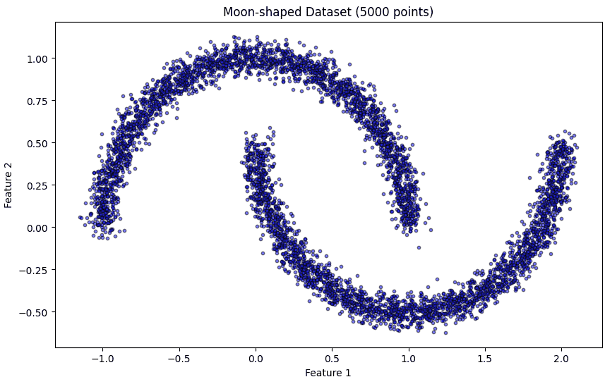
Here we generate a 2D moon-shaped dataset with 5000 points and some noise.
X, _ = make_moons(n_samples=5000, noise=0.05, random_state=42)
Step 3: Visualize the Dataset
Before clustering, we plot the dataset to understand its structure. Smaller markers and semi-transparency help in visualizing large datasets clearly.
plt.figure(figsize=(10, 6))
plt.scatter(X[:, 0], X[:, 1], c='blue', s=10, alpha=0.5, edgecolor='k')
plt.title('Moon-shaped Dataset (5000 points)')
plt.xlabel('Feature 1')
plt.ylabel('Feature 2')
plt.show()
Output:
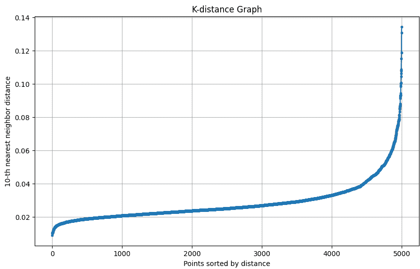
Step 4: Plot k-distance Graph for Epsilon Selection
The k-distance graph shows the distance of each point to its k-th nearest neighbor. The “elbow” of this graph helps in selecting the optimal epsilon (eps) for DBSCAN.
The k-distance graph plots each point’s distance to its k-th nearest neighbor to help choose the optimal epsilon for DBSCAN.
def plot_k_distance_graph(X, k):
    neigh = NearestNeighbors(n_neighbors=k)
    neigh.fit(X)
    distances, _ = neigh.kneighbors(X)
    distances = np.sort(distances[:, k-1])

    plt.figure(figsize=(10, 6))
    plt.plot(distances, marker='o', markersize=3)
    plt.xlabel('Points sorted by distance')
    plt.ylabel(f'{k}-th nearest neighbor distance')
    plt.title('K-distance Graph')
    plt.grid(True)
    plt.show()

plot_k_distance_graph(X, k=10)
Output:
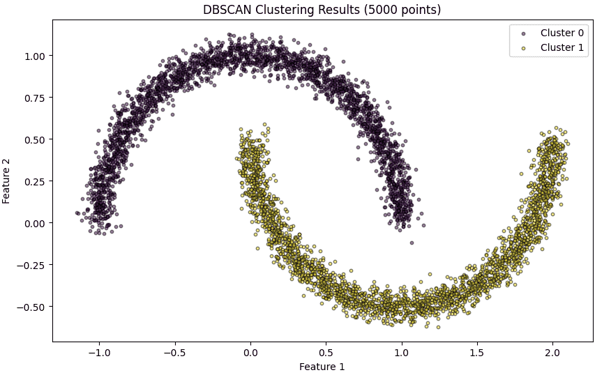
Step 5: Apply DBSCAN Clustering
Here we apply DBSCAN on the dataset with the chosen eps and min_samples. DBSCAN automatically identifies clusters of varying shapes and sizes and labels noise points as -1.
epsilon = 0.12
min_samples = 10
dbscan_model = DBSCAN(eps=epsilon, min_samples=min_samples)
cluster_labels = dbscan_model.fit_predict(X)
Step 6: Visualize DBSCAN Clustering Results
Plot each cluster with a unique color. Noise points are highlighted in red. Smaller marker size and transparency make the visualization clear for 5000 points.
plt.figure(figsize=(10, 6))

unique_labels = set(cluster_labels)
colors = plt.cm.viridis(np.linspace(0, 1, len(unique_labels)))

for k, col in zip(unique_labels, colors):
    class_member_mask = (cluster_labels == k)
    xy = X[class_member_mask]
    if k == -1:
        plt.scatter(xy[:, 0], xy[:, 1], c='red', s=10, alpha=0.5, edgecolor='k', label='Noise')
    else:
        plt.scatter(xy[:, 0], xy[:, 1], c=[col], s=10, alpha=0.5, edgecolor='k', label=f'Cluster {k}')

plt.title('DBSCAN Clustering Results (5000 points)')
plt.xlabel('Feature 1')
plt.ylabel('Feature 2')
plt.legend()
plt.show()
Output:
Step 7: Summary of Clusters
Here we summarize the number of clusters detected by DBSCAN and the points that were classified as noise.
n_clusters = len(set(cluster_labels)) - (1 if -1 in cluster_labels else 0)
n_noise = list(cluster_labels).count(-1)
print(f'Number of clusters found: {n_clusters}')
print(f'Number of noise points: {n_noise}')
Output:
Number of clusters found: 2
Number of noise points: 0
Download full code from here.